.
Dialoogvenster Raster-eigenschappen
Dubbelklik op de naam van een rasterlaag in de legenda of selecteer de laag en gebruik de rechter muisknop en kies Eigenschappen uit het contextmenu om de eigenschappen van een rasterlaag te bekijken en in te stellen. Dit zal het dialoogvenster Laag-eigenschappen voor de rasterlaag openen (zie figure_raster_1).
Het dialoogvenster bevat verschillende tabbladen:
Algemeen
Stijl
Transparantie
Piramiden
- Histogram
- Metadata
Figure Raster 1:
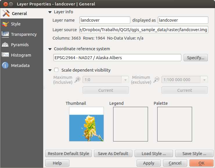
Raster Layers Properties Dialog 
Tabblad Stijl
Enkelbands renderen
QGIS offers four different Render types. The renderer chosen is dependent on the data type.
Multiband kleur - als het bestand een multiband is met verschillende banden (bijv. gebruikt in een satellietfoto met verschillende banden)
Palet - als een enkel bandbestand een geïndexeerd palet heeft (bijv. gebruikt in een digitale topografische kaart)
- Singleband gray - (one band of) the image will be rendered as gray; QGIS will choose this renderer if the file has neither multibands nor an indexed palette nor a continous palette (e.g., used with a shaded relief map)
Enkelbands pseudokleur - deze renderer is mogelijk voor bestanden met een doorlopend palet, of kleurenkaart (bijv. gebruikt in een hoogtekaart)
Multibands kleur
Met de renderer Multiband kleur zullen drie banden van de afbeelding worden gebruikt om te renderen, waarbij elke band staat voor de rode, groene of blauwe component die worden gebruikt om een kleurenafbeelding op te bouwen. U kunt kiezen uit verschillende methoden Contrastverbetering: ‘Geen verbetering’, ‘Stretch tot MinMax’, ‘Stretch en clip tot MinMax’ en ‘Clip tot min max’.
Figure Raster 2:
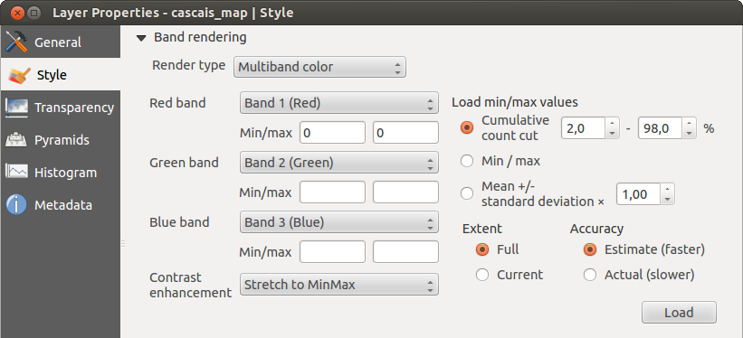
Raster Renderer - Multiband color
This selection offers you a wide range of options to modify the appearance
of your raster layer. First of all, you have to get the data range from your
image. This can be done by choosing the Extent and pressing
[Load]. QGIS can  Estimate (faster) the
Min and Max values of the bands or use the
Estimate (faster) the
Min and Max values of the bands or use the
 Actual (slower) Accuracy.
Now you can scale the colors with the help of the Load min/max values section.
A lot of images have a few very low and high data. These outliers can be eliminated
using the Cumulative count cut setting. The standard data range is set
from 2% to 98% of the data values and can be adapted manually. With this
setting, the gray character of the image can disappear.
With the scaling option Min/max, QGIS creates a color table with all of
the data included in the original image (e.g., QGIS creates a color table
with 256 values, given the fact that you have 8 bit bands).
You can also calculate your color table using the Mean +/- standard deviation x  .
Then, only the values within the standard deviation or within multiple standard deviations
are considered for the color table. This is useful when you have one or two cells
with abnormally high values in a raster grid that are having a negative impact on
the rendering of the raster.
.
Then, only the values within the standard deviation or within multiple standard deviations
are considered for the color table. This is useful when you have one or two cells
with abnormally high values in a raster grid that are having a negative impact on
the rendering of the raster.
All calculations can also be made for the Current extent.
Tip
Het tonen van een enkel- of multiband raster
Wanneer u een enkele band raster wilt tonen (bijvoorbeeld de rode) van een multiband afbeelding, zou u denken dat u de groene en blauwe band uitschakelt. Maar dat is niet de goede manier. Zet het imagetype naar grijstinten en selecteer rood als de te gebruiken band voor Grijstinten om de rode band te tonen.
Palet
This is the standard render option for singleband files that already include a color table, where each pixel value is assigned to a certain color. In that case, the palette is rendered automatically. If you want to change colors assigned to certain values, just double-click on the color and the Select color dialog appears. Also, in QGIS 2.2. it’s now possible to assign a label to the color values. The label appears in the legend of the raster layer then.
Figure Raster 3:

Raster Renderer - Paletted
Contrastverhoging
Notitie
When adding GRASS rasters, the option Contrast enhancement will always be set automatically to stretch to min max, regardless of if this is set to another value in the QGIS general options.
Enkelbands grijs
This renderer allows you to render a single band layer with a Color gradient:
‘Black to white’ or ‘White to black’. You can define a Min
and a Max value by choosing the Extent first and
then pressing [Load]. QGIS can Estimate (faster) the
Min and Max values of the bands or use the
Actual (slower) Accuracy.
Figure Raster 4:
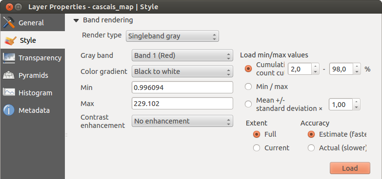
Raster Renderer - Singleband gray
With the Load min/max values section, scaling of the color table
is possible. Outliers can be eliminated using the Cumulative count cut setting.
The standard data range is set from 2% to 98% of the data values and can
be adapted manually. With this setting, the gray character of the image can disappear.
Further settings can be made with Min/max and
Mean +/- standard deviation x .
While the first one creates a color table with all of the data included in the
original image, the second creates a color table that only considers values
within the standard deviation or within multiple standard deviations.
This is useful when you have one or two cells with abnormally high values in
a raster grid that are having a negative impact on the rendering of the raster.
Enkelbands pseudokleur
This is a render option for single-band files, including a continous palette. You can also create individual color maps for the single bands here.
Figure Raster 5:
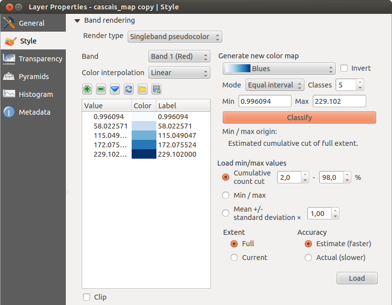
Raster Renderer - Singleband pseudocolor
Er zijn drie manieren van kleurinterpolatie beschikbaar:
Discreet
Lineair
- Exact
In the left block, the button  Add values manually adds a value to the
individual color table. The button
Add values manually adds a value to the
individual color table. The button  Remove selected row
deletes a value from the individual color table, and the
Remove selected row
deletes a value from the individual color table, and the
 Sort colormap items button sorts the color table according
to the pixel values in the value column. Double clicking on the value column lets
you insert a specific value. Double clicking on the color column opens the dialog
Change color, where you can select a color to apply on that value. Further,
you can also add labels for each color, but this value won’t be displayed when you use the identify
feature tool.
You can also click on the button
Sort colormap items button sorts the color table according
to the pixel values in the value column. Double clicking on the value column lets
you insert a specific value. Double clicking on the color column opens the dialog
Change color, where you can select a color to apply on that value. Further,
you can also add labels for each color, but this value won’t be displayed when you use the identify
feature tool.
You can also click on the button  Load color map from band,
which tries to load the table from the band (if it has any). And you can use the
buttons
Load color map from band,
which tries to load the table from the band (if it has any). And you can use the
buttons  Load color map from file or
  Export color map to file to load an existing color table or to save the
defined color table for other sessions.
Export color map to file to load an existing color table or to save the
defined color table for other sessions.
In the right block, Generate new color map allows you to create newly
categorized color maps. For the Classification mode  ‘Equal interval’,
you only need to select the number of classes
and press the button Classify. You can invert the colors
of the color map by clicking the
‘Equal interval’,
you only need to select the number of classes
and press the button Classify. You can invert the colors
of the color map by clicking the  Invert
checkbox. In the case of the Mode ‘Continous’, QGIS creates
classes automatically depending on the Min and Max.
Defining Min/Max values can be done with the help of the Load min/max values section.
A lot of images have a few very low and high data. These outliers can be eliminated
using the Cumulative count cut setting. The standard data range is set
from 2% to 98% of the data values and can be adapted manually. With this
setting, the gray character of the image can disappear.
With the scaling option Min/max, QGIS creates a color table with all of
the data included in the original image (e.g., QGIS creates a color table
with 256 values, given the fact that you have 8 bit bands).
You can also calculate your color table using the Mean +/- standard deviation x .
Then, only the values within the standard deviation or within multiple standard deviations
are considered for the color table.
Invert
checkbox. In the case of the Mode ‘Continous’, QGIS creates
classes automatically depending on the Min and Max.
Defining Min/Max values can be done with the help of the Load min/max values section.
A lot of images have a few very low and high data. These outliers can be eliminated
using the Cumulative count cut setting. The standard data range is set
from 2% to 98% of the data values and can be adapted manually. With this
setting, the gray character of the image can disappear.
With the scaling option Min/max, QGIS creates a color table with all of
the data included in the original image (e.g., QGIS creates a color table
with 256 values, given the fact that you have 8 bit bands).
You can also calculate your color table using the Mean +/- standard deviation x .
Then, only the values within the standard deviation or within multiple standard deviations
are considered for the color table.
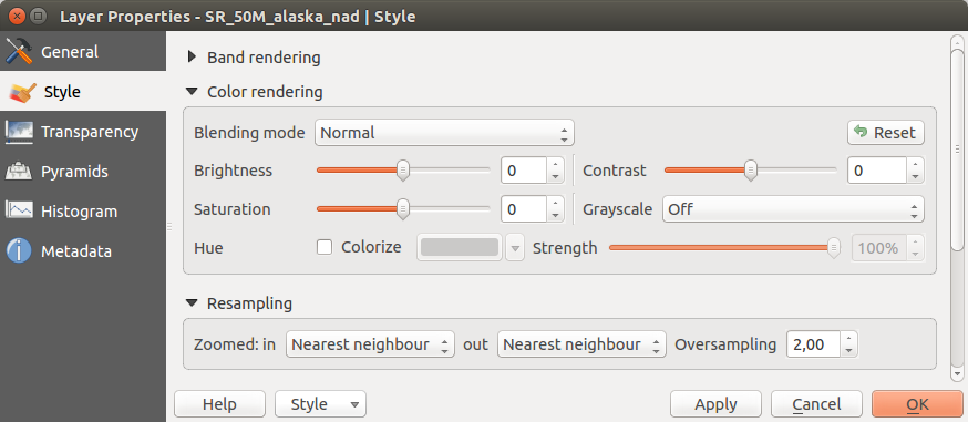
Het renderen van kleuren
Voor elke Bandrendering is een Kleurrendering mogelijk.
U kunt ook speciale effecten voor renderen voor uw rasterbestand(en) bereiken met behulp van de Meng-modi (zie Het dialoogvenster Vectoreigenschappen).
Further settings can be made in modifiying the Brightness, the Saturation and the Contrast. You can also use a Grayscale option, where you can choose between ‘By lightness’, ‘By luminosity’ and ‘By average’. For one hue in the color table, you can modify the ‘Strength’.
Resampling
De optie Resample verschijnt als u in- en uitzoomt in een afbeelding. Modi voor Resample kunnen het uiterlijk van de kaart optimaliseren. Zij berekenen een nieuwe matrix voor grijswaarden door middel van een geometrische transformatie.
Figure Raster 6:
Raster Rendering - Resampling
Bij het toepassen van de methode ‘Dichtstbijzijnde buur’ kan de kaart een gepixelde structuur hebben bij het inzoomen. Dit uiterlijk kan worden verbeterd door de methoden ‘Bilineair’ of ‘Kubisch’ te gebruiken, wat scherpe objecten vervaagt. Het effect is een gladdere afbeelding. Deze methode kan bijvoorbeeld worden toegepast bij digitale topografische rasterkaarten.
Tabblad Transparantie
QGIS has the ability to display each raster layer at a different transparency level.
Use the transparency slider 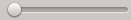 to indicate to what extent the underlying layers
(if any) should be visible though the current raster layer. This is very useful
if you like to overlay more than one raster layer (e.g., a shaded relief map
overlayed by a classified raster map). This will make the look of the map more
three dimensional.
to indicate to what extent the underlying layers
(if any) should be visible though the current raster layer. This is very useful
if you like to overlay more than one raster layer (e.g., a shaded relief map
overlayed by a classified raster map). This will make the look of the map more
three dimensional.
Daarnaast kunt u aangeven welke rasterwaarde als Geen gegevens behandeld moet worden in het menu Extra waarde ‘Geen gegevens’.
Een meer flexibelere manier om de transparantie te regelen kan uitgevoerd worden via Aangepaste transparantie opties. Hier kan de transparantie voor elke pixelwaarde worden ingesteld.
As an example, we want to set the water of our example raster file landcover.tif to a transparency of 20%. The following steps are neccessary:
Laad het rasterbestand landcover.tif.
Open het dialoogvenster Eigenschappen door te dubbelklikken op de rasterlaag in de legenda of via het contextmenu dat via de rechter muisknop in de legenda geopend wordt voor de geselecteerde rasterlaag en te kiezen voor Eigenschappen.
Selecteer het menu Transparantie
Kies ‘Geen’ in het menu Transparantie band.
- Click the Add values manually
button. A new row will appear in the pixel list.
Geef de rasterwaarde op (we gebruiken hier 0) in de kolom ‘Van’ en ‘Tot’ en pas daarvan de transparantie aan naar 20%.
Druk op de knop [Apply] en controleer het resultaat van de kaart.
Stappen 5 en 6 kunnen herhaald worden om meer waarden te wijzigen met een aangepaste transparantie.
As you can see, it is quite easy to set custom transparency, but it can be
quite a lot of work. Therefore, you can use the button  Export to file to save your transparency list to a file. The button
Import from file loads your transparency settings and
applies them to the current raster layer.
Export to file to save your transparency list to a file. The button
Import from file loads your transparency settings and
applies them to the current raster layer.
Tabblad Piramiden
Large resolution raster layers can slow navigation in QGIS. By creating lower resolution copies of the data (pyramids), performance can be considerably improved, as QGIS selects the most suitable resolution to use depending on the level of zoom.
U moet schrijfrechten hebben voor de map waarin de originele rastergegevens zijn opgeslagen om piramiden te bouwen.
Verschillende methoden voor resamplen kunnen worden gebruikt om piramiden te berekenen:
‘Dichtstbijzijnde buur’
Gemiddelde
- Gauss
Kubisch
Modus
Geen
If you choose ‘Internal (if possible)’ from the Overview format menu, QGIS tries to build pyramids internally. You can also choose ‘External’ and ‘External (Erdas Imagine)’.
Figure Raster 7:
The Pyramids Menu
Onthoud dat het bouwen van piramiden de originele databestanden kan veranderen en dat intern aangemaakte piramiden niet meer verwijderd kunnen worden. Het is dan ook altijd verstandig om van het origineel, zonder piramiden, eerst een kopie te maken en te bewaren.
menu Histogram
The Histogram menu allows you to view the distribution of the bands
or colors in your raster. The histogram is generated automatically when you open the
Histogram menu. All existing bands will be displayed together. You can
save the histogram as an image with the button.
With the Visibility option in the  Prefs/Actions menu,
you can display histograms of the individual bands. You will need to select the option
Show selected band.
The Min/max options allow you to ‘Always show min/max markers’, to ‘Zoom
to min/max’ and to ‘Update style to min/max’.
With the Actions option, you can ‘Reset’ and ‘Recompute histogram’ after
you have chosen the Min/max options.
Prefs/Actions menu,
you can display histograms of the individual bands. You will need to select the option
Show selected band.
The Min/max options allow you to ‘Always show min/max markers’, to ‘Zoom
to min/max’ and to ‘Update style to min/max’.
With the Actions option, you can ‘Reset’ and ‘Recompute histogram’ after
you have chosen the Min/max options.
Figure Raster 8:

Raster Histogram
menu Metadata
Het tabblad Metadata toont veel informatie over de rasterlaag, inclusief statistieken over elke band in de huidige rasterlaag. In dit tabblad zijn de onderdelen Beschrijving, Attributen, MetadataUrl en Eigenschappen aanwezig. In Eigenschappen worden statistieken verzameld wanneer nodig, het is dus best mogelijk dat voor een gegeven laag de statistieken nog niet zijn verzameld of inmiddels verouderd zijn.
Figure Raster 9:
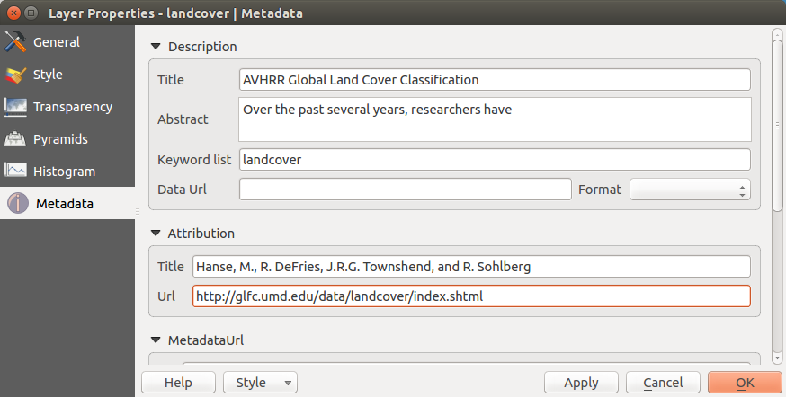
Raster Metadata