Con il Compositore di Stampa puoi creare mappe belle e atlanti, che possono essere stampati o salvati in formato PDF, immagine o SVG. Questo è utile per condividere informazioni geografiche prodotte con QGIS che possono essere incluse in relazioni o pubblicate.
Il compositore di stampe ti permette di creare layout di stampa molto potenti. Ti permette di aggiungere elementi come la mappa che hai creato in QGIS, etichette di testo, immagini, legende, barre di scala, forme semplici, frecce, tabelle degli attributi e cornici HTML. Puoi scegliere la dimensione, raggruppare e allineare la posizione di ogni elemento e aggiustarne le proprietà. Puoi esportare la composizione che hai creato in vari formati, PostScript, PDF o SVG (l’esportazione SVG non funziona sempre correttamente a causa della recente versione di Qt4: devi provare e verificare di persona sul tuo computer). Puoi salvare i layout come modelli e caricarli in seguito in altre sessioni. Infine, puoi anche creare facilmente diverse mappe basate sullo stesso modello grazie al generatore atlante. Vedi l’elenco degli strumenti in table_composer_1:
Tutti gli strumenti del compositore di stampe sono disponibili sia dai menu che dalle icone. Puoi disattivare la barra degli strumenti facendo click con il tasto destro del mouse sulla barra stessa.
Primi passi
Aprire un nuovo modello di stampa
Prima di iniziare a lavorare con il compositore di stampe, devi caricare qualche raster e vettore nella mappa di QGIS e aggiustarne qualche proprietà. Una volta che hai scelto la visualizzazione e la simbologia clicca sull’icona  Nuova composizione di stampa oppure clicca su . Ti verrà chiesto di inserire un titolo per la composizione.
Panoramica del compositore di stampe
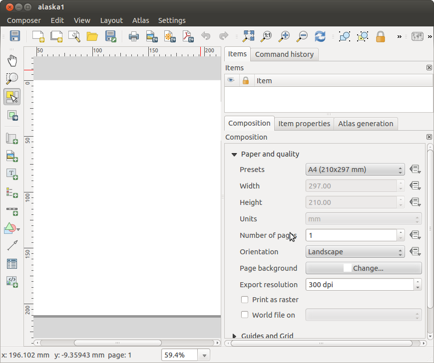
All’apertura il compositore di stampa presenta una mappa bianca che rappresenta la superficie del foglio da utilòizzare per la stampa. Trovi icone per aggiungere voci mappa compositore; l’attuale QGIS mappa, testi, immagini, leggende, barre di scala, forme base, frecce, tabelle di attributi e frame HTML. Negli strumenti trovi la barra degli strumenti per navigare, lo zoom e panoramica della vista, la barra degli strumenti per selezionare un elemento della mappa compositore e per spostare il contenuto della mappa.
Figure_composer_overview mostra la vista iniziale del compositore di stampa prima dell’aggiunta di elementi.
Figure Composer Overview:
A destra della mappa accanto la tela si trovano due pannelli. Il pannello superiore contiene le schede: guilabel: `` degli articoli e: guilabel: Command Storia dell’Attore e il pannello inferiore contiene le schede: guilabel: Composizione`,: guilabel: Proprietà oggetto,guilabel:Generazione atlante e: guilabel:Oggetti.
La scheda Items mostra una lista di tutti gli oggetti agginti al foglio.
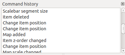
La scheda: guilabel:Storico dei comandi visualizza una cronologia di tutte le modifiche applicate al compositore. Con un clic del mouse, è possibile annullare e ripetere le operazioni avanti e indietro.
La scheda :guilabel: Composizione consente di impostare il formato del foglio, l’orientamento, lo sfondo della pagina, il numero di pagine e qualità di stampa per il file di output in dpi. Inoltre, puoi attivare la |casella| :guilabel: Stampa come raster. Ciò significa che tutti gli articoli saranno convertiti in raster prima di stampare o salvare in PostScript o PDF. In questa scheda, puoi anche personalizzare le impostazioni per reticolo e guide.
La scheda Proprietà oggetto mostra le proprietà dell’oggetto selezionato. Clic  Seleziona/Sposta oggetto icona per selezionare un elemento (ad esempio, la leggenda, barra di scala o etichetta) sul foglio. Quindi fare clic sulla scheda Proprietà oggetto e personalizza le impostazioni per l’elemento selezionato.
La scheda Generazione atlante ti permette di abilitare la generazioni di un atlante per la composizione attuale avrai accesso a tutti i suoi parametri.
Infine, puoi salvare la composizione di stampa con il bottone  : sup: Salva progetto.
Nella parte inferiore della finestra del compositore di stampe, troverai una barra di stato con la posizione del mouse, il numero attuale della pagine e un menu a tendina per selezionare il livello di zoom.
Puoi aggiungere elementi multipli al compositore. Puoi anche visualizzare più di una mappa o legenda o barra di scala nella vista del compositore su una o più pagine. Ogni elemento ha le sue proprietà e, nel caso della mappa, la sua estensione. Se vuoi rimuovere un qualsiasi elemento dalla vista selezionalo e premi il pulsante Delete o Backspace.
Esempio
Per creare una mappa segui le seguenti istruzioni.
Nella Barra degli strumenti Oggetti del compositore, selezionare il  Aggiungi nuova mappa e disegna un rettangolo sulla tela tenendo premuto il tasto sinistro del mouse. All’interno del rettangolo disegnato la visualizzazione della mappa QGIS alla tela.
Seleziona  Aggiungi nuova barra di scala e posiziona l’oggetto con il pulsante sinistro del mouse sul foglio del compositore di stampe. Una barra di scala sarà aggiunta.
Seleziona il bottone  Aggiungi nuova legenda e disegna un rettangolo sul foglio tenendo premuto il pulsante sinistro del mouse. Nel rettangolo verrà disegnata una legenda.
Seleziona Seleziona/Muovi oggetto per selezionare la mappa sul foglio e spostarla.
Mentre l’oggetto mappa è selezionato puoi modificare le dimensioni della mappa. Fai clic tenendo premuto il tasto sinistro del mouse, in un piccolo rettangolo bianco in uno degli angoli della mappa e scegli una nuova posizione per modificare la sua dimensione.
Scegli la scheda Proprietà oggetto e imposta Rotazione mappa di ‘15.00° ‘. VedraI cambiare l’orientamento del contenuto della mappa.
Infine, puoi salvare la composizione di stampa con il bottone : sup: Salva progetto.
Opzioni compositore di stampe
Dal menu puoi scegliere alcune opzioni che verranno usate in maniera predefinita durante il flusso di lavoro.
Opzioni predefinite del compositore ti permette di scegliere il carattere da usare.
Con l’opzione Reticolo puoi selezionare lo stile e il colore del reticolo.
Da Opzioni predefinite per il reticolo puoi specificare la spaziatura, lo scostamento e la tolleranza del reticolo. Ci sono tre tipi di reticolo: Punti, Pieno e Croci.
Opzioni predefinite per le guide ti permette di scegliere la tolleranza delle guide.
Scheda Composizione — Impostazioni generali
Nella scheda Composizione puoi scegliere le impostazioni generali della tua composizione di stampa.
Puoi scegliere una delle opzioni Preimpostazioni per i tuoi fogli di carta oppure puoi inserire manualmente i valori di larghezza e altezza.
Puoi ora dividere la composizione in diverse pagine. Per esempio, la prima pagina mostra una mappa, la seconda mostra la tabella degli attributi di un vettore e la terza mostra una cornice HTML della tua azienda. Imposta il Numero di pagine con il valore che preferisci. Puoi scegliere l’Orientamento e la Risoluzione di esportazione. Quando spuntata, la casella di controllo  stampa come raster permette di trasformare in raster tutti gli elementi prima del salvataggio o esportazione in PostScript o PDF.
Reticolo ti permette di personalizzare: spaziatura, offset e tolleranza.
In Tolleranza di snap puoi cambiare la Tolleranza ovvero la distanza massima ai quali gli oggetti vengono agganciati alle guide.
Puoi attivare l’aggancio al reticolo e/o le guide intelligenti dal menu . In questo menu puoi anche scegliere se mostrare o nascondere il reticolo e le guide intelligenti.
Composer items common options
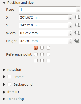
Gli oggetti del compositore hanno proprietà comuni che trovi nella scheda Proprietà oggetto: Posizione e dimensione, Rotazione, Cornice, Sfondo, ID oggetto e visualizzazione (Vedi figure_composer_common_1)
Figure Composer Common 1:
La voce Posizione e dimensione ti permette di scegliere la posizione della cornice che contiene l’oggetto. Puoi anche scegliere quale deve essere il Punto di riferimento delle coordinate X e Y.
Con Rotazione puoi impostare la rotazione dell’elemento (in gradi).
La casella di controllo Cornice mostra o nasconde la cornice. Clicca sui pulsanti [Colore] e [Spessore] per specificarne i valori.
La casella di controllo Sfondo ti permette di attivare/disattivare un colore di sfondo. Clicca sul pulsante [Colore...] per visualizzare una finestra di dialogo dove puoi cliccare su un colore o sceglierne uno fra quelli predefiniti. Puoi anche aggiustare la trasparenza attraverso il campo alpha.
Usa ID oggetto per creare una relazione con altri oggetti del compositore. Questa opzione è usata con QGIS server e altri potenziali web client. Puoi impostare un ID di un oggetto (per esempio una mappa e un’etichetta) e poi il web client sarà in grado di impostare un corretto stile per i dati (esempio le etichette). Il comando GetProjectSettings elencherà gli oggetti e quali ID sono disponibili nel layout.
Puoi selezionare la modalità Visualizzazione con la giusta opzione. Vedi Rendering_Mode.
Nota
- If you checked Use live-updating color chooser dialogs
in the QGIS general options, the color button will update as soon as you
choose a new color from Color Dialog windows. If not, you need to
close the Color Dialog.
- The
 Data defined override icon next to a field
means that you can associate the field with data in the map item or use
expressions. These are particularly helpful with atlas generation
(See atlas_data_defined_overrides).
Data defined override icon next to a field
means that you can associate the field with data in the map item or use
expressions. These are particularly helpful with atlas generation
(See atlas_data_defined_overrides).
Oggetti del compositore
The Map item
Clicca sul pulsante Aggiungi mappa presente nella barra degli strumenti del compositore per aggiungere una mappa. Ora tieni premuto il pulsante del mouse e trascina il rettangolo corrispondente per aggiungere la mappa. Per visualizzare la mappa attuale puoi scegliere fra tre differenti modalità accessibili dalla scheda Proprietà oggetto:
Rettangolo visualizza un rettangolo vuoto con la scritta ‘La mappa verrà stampata qui’.
Cache disegna la mappa alla risoluzione corrente dello schermo. Se ingrandisci/rimpiccolisci la finestra del compositore, la mappa non viene ridisegnata, ma l’immagine viene scalata.
Visualizza a differenza del metodo cache, in questo caso se ridimensioni la finestra del compositore, la mappa viene ridisegnata.
Cache è la modalità predefinita per ogni nuova composizione di stampa.
Puoi ridimensionare la mappa in un momento successivo cliccando sul pulsante  Seleziona/Sposta oggetto, selezionando un elemento e trascinando uno dei quadrati agli angoli della mappa. Una volta selezionata una mappa, puoi regolarne ulteriori proprietà nella scheda Opzioni oggetto.
To move layers within the map element, select the map element, click the
 Move item content icon and move the layers within
the map item frame with the left mouse button. After you have found the right place
for an item, you can lock the item position within the Print Composer
canvas. Select the map item and use the toolbar
Move item content icon and move the layers within
the map item frame with the left mouse button. After you have found the right place
for an item, you can lock the item position within the Print Composer
canvas. Select the map item and use the toolbar  Lock Selected Items or the tab to Lock the
item. A locked item can only be selected using the
tab. Once selected you can use the tab to unlock individual items. The
Lock Selected Items or the tab to Lock the
item. A locked item can only be selected using the
tab. Once selected you can use the tab to unlock individual items. The  Unlock All Items icon will unlock all locked composer items.
Proprietà principali
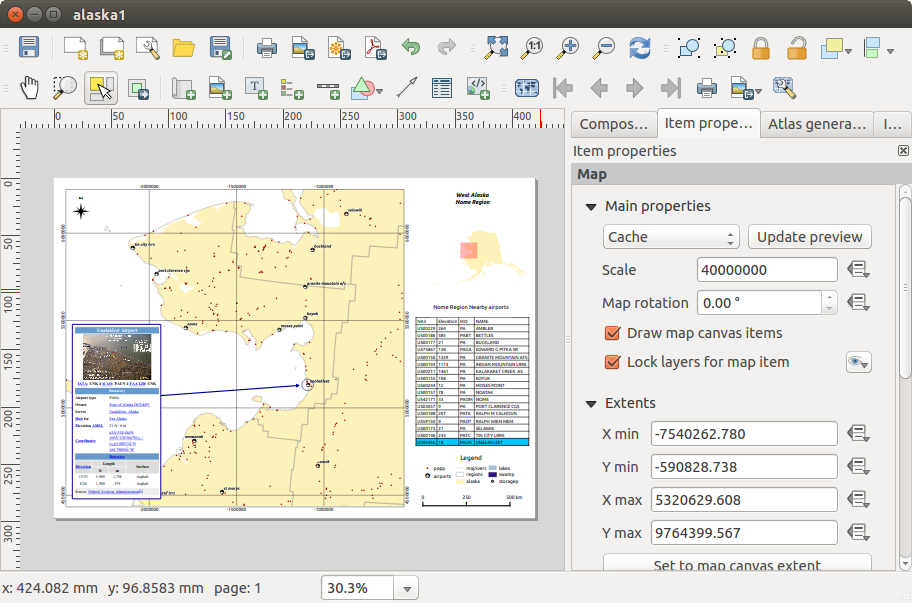
The Main properties dialog of the map Item Properties tab provides the
following functionalities (see figure_composer_map_1):
Figure Composer Map 1:
Estensione mappa
The Extents dialog of the map item tab provides the following
functionalities (see figure_composer_map_2):
Figure Composer Map 2:
- The Map extents area allows you to specify the map extent using X and Y min/max
values and by clicking the [Set to map canvas extent] button. This button sets
the map extent of the composer map item to the extent of the current map view in the
main QGIS application. The button [View extent in map canvas] does exactly the
opposite, it updates the extent of the map view in the QGIS application to the extent
of the composer map item.
If you change the view on the QGIS map canvas by changing
vector or raster properties, you can update the Print Composer view by selecting
the map element in the Print Composer and clicking the [Update preview] button
in the map Item Properties tab (see figure_composer_map_1).
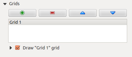
Grids
The Grids dialog of the map Item Properties tab provides the
the possibility to add several grids to a map item.
- With the plus and minus button you can add or remove a selected grid.
- With the up and down button you can move a grid in the list and set the drawing priority.
When you double click on the added grid you can give it another name.
Figure Composer Map 3:
After you have added a grid, you can active the checkbox Show grid to overlay a grid onto the
map element. Expand this option to provides a lot of configuration options, see Figure_composer_map_4.
Figure Composer Map 4:
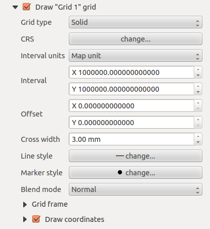
As grid type, you can specify to use a solid line or cross. Symbology of
the grid can be chosen. See section Rendering_Mode.
Furthermore, you can define an interval in the X and Y directions, an X and Y offset,
and the width used for the cross or line grid type.
Figure Composer Map 5:
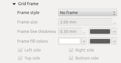
- There are different options to style the frame that holds the map. Following options are
available: No Frame, Zebra, Interior ticks, Exterior ticks, Interior and Exterior ticks and Lineborder.
- Advanced rendering mode is also available for grids (see section Rendering_mode).
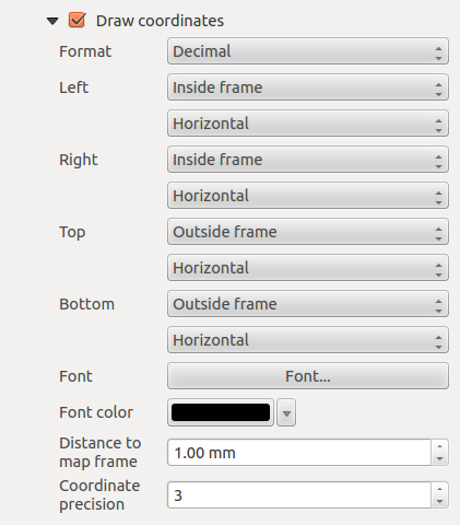
La casella di controllo Scrivi coordinate ti permette di aggiungere le coordinate alla mappa. Le coordinate possono essere scritte dentro o fuori la mappa e puoi scegliere di visualizzare orizzontali o verticali individualmente per ogni lato della mappa. Puoi scegliere le unità in metri o in gradi. Infine puoi anche scegliere il colore del reticolo, il carattere delle coordinate la distanza rispetto alla cornice e la loro precisione.
Figure Composer map 6:
Overviews
The Overviews dialog of the map Item Properties tab provides the
following functionalities:
Figure Composer Map 7:
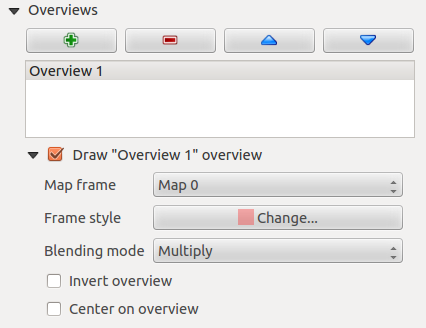
You can choose to create an overview map, which shows the extents of the other map(s)
that are available in the composer. First you need to create the map(s) you want to
include in the overview map. Next you create the map you want to use as the overview
map, just like a normal map.
- With the plus and minus button you can add or remove an overview.
- With the up and down button you can move an overview in the list and set the drawing priority.
Open Overviews and press the green plus icon-button to add an overview.
Initially this overview is named ‘Overview 1’ (see Figure_composer_map_7).
You can change the name when you double-click on the overview item in the list
named ‘Overview 1’ and change it to another name.
When you select the overview item in the list you can customize it.
- The Draw “<name_overview>” overview needs to be activated to
draw the extent of selected map frame.
- The Map frame combo list can be used to select the map item whose extents
will be drawn on the present map item.
- The Frame Style allows you to change the style of the overview frame.
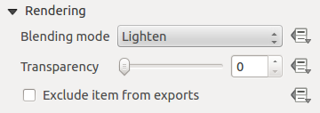
- The Blending mode allows you to set different transparency blend modes.
See Rendering_Mode.
- The Invert overview creates a mask around the extents when
activated: the referenced map extents are shown clearly, whereas everything else
is blended with the frame color.
- The Center on overview puts the extent of the overview frame in
the center of the overview map. You can only activate one overview item to center, when
you have added several overviews.
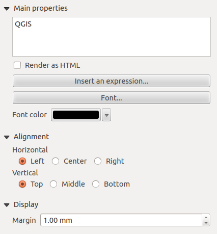
The Label item
Per aggiungere un’etichetta, clicca sull’icona  Aggiungi etichetta e scegli dove inserirla cliccando sulla mappa con il mouse. Puoi personalizzare le etichette nella scheda Proprietà oggetto.
The Item Properties tab of a label item provides the following functionality
for the label item (see Figure_composer_label):
Figure Composer 8:
Proprietà principali
La voce proprietà principali è il posto dove devi inserire il testo (HTML oppure normale) o l’espressione che vuoi che compaia sull’etichetta.
Puoi inserire del testo HTML per le etichette: spunta la casella di controllo Visualizza come HTML. Ora puoi inserire un URL, un’immagine collegata a un sito web oppure qualcosa di più complesso.
- You can also insert an expression. Click on [Insert an expression] to open a new dialog.
Build an expression by clicking the functions available in the left side of the panel.
Two special categories can be useful, particularly associated with the atlas functionality:
geometry functions and records functions. At the bottom, a preview of the expression is shown.
- Define Font by clicking on the [Font...] button or a Font color
selecting a color using the color selection tool.
Allineamento e visualizzazione
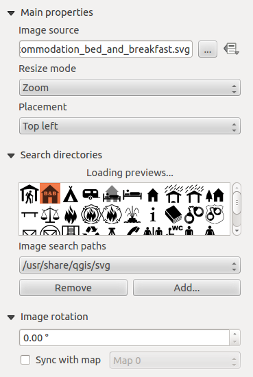
The Image item
Per aggiungere un’immagine, clicca sull’icona  Aggiungi immagine e scegli dove inserirla cliccando sulla mappa con il mouse. Puoi personalizzare l’immagine nella scheda Proprietà oggetto.
The image Item Properties tab provides the following functionalities (see figure_composer_image_1):
Figure Composer image 1:
You first have to select the image you want to display.
There are several ways to set the image source in the Main properties area.
- Use the browse button
 of image source to select a file on your
computer using the browse dialog. The browser will start in the SVG-libraries provided with QGIS.
Besides SVG, you can also select other image formats like .png or .jpg.
of image source to select a file on your
computer using the browse dialog. The browser will start in the SVG-libraries provided with QGIS.
Besides SVG, you can also select other image formats like .png or .jpg.
- You can enter the source directly in the image source text field. You can even provide
a remote URL-address to an image.
- From the Search directories area you can also select an image from loading preview..
to set the image source.
- Use the data defined button to set the image source from a record or using a
regular expression.
With the Resize mode option, you can set how the image is displayed when the frame
is changed, or choose to resize the frame of the image item so it matches the original size of
the image.
You can select one of the following modes:
- Zoom: Enlarges the image to the frame while maintaining aspect ratio of picture.
- Stretch: Stretches image to fit inside the frame, ignores aspect ratio.
- Clip: Use this mode for raster images only, it sets the size of the image to original image size
without scaling and the frame is used to clip the image, so only the part of the image inside the
frame is visible.
- Zoom and resize frame: Enlarges image to fit frame, then resizes frame to fit resultant image.
- Resize frame to image size: Sets size of frame to match original size of image without scaling.
Selected resize mode can disable the item options ‘Placement’ and ‘Image rotation’.
The Image rotation is active for the resize mode ‘Zoom’ and ‘Clip’.
With Placement you can select the position of the image inside it’s frame.
The Search directories area allows you to add and remove directories with images in SVG format
to the picture database. A preview of the pictures found in the selected directories is shown in a
pane and can be used to select and set the image source.
Images can be rotated with the Image rotation field.
Activating the Sync with map checkbox synchronizes the rotation of a picture
in the QGIS map canvas (i.e., a rotated north arrow) with the appropriate Print Composer image.
It is also possible to select a north arrow directly. If you first select a north arrow image from
Search directories and then use the browse button of the field Image source,
you can now select one of the north arrow from the list as displayed in figure_composer_image_2.
Nota
Many of the north arrows do not have an ‘N’ added in the north arrow, this is done on
purpose for languages that do not use an ‘N’ for North, so they can use another letter.
Figure Composer Image 2:
The Legend item
Per aggiungere una legenda, clicca su Aggiungi legenda, e scegli dove posizionarla con il tasto sinistro del mouse. Puoi personalizzare l’aspetto della legenda nella scheda Proprietà oggetto.
The Item properties of a legend item tab provides the following
functionalities (see figure_composer_legend_1):
Figure Composer Legend 1:
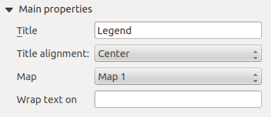
Proprietà principali
The Main properties dialog of the legend Item Properties tab
provides the following functionalities (see figure_composer_legend_2):
Figure Composer Legend 2:
In Main properties you can:
- Change the title of the legend.
- Set the title alignment to Left, Center or Right.
- You can choose which Map item the current legend will refer to
in the select list.
- You can wrap the text of the legend title on a given character.
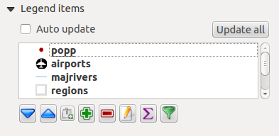
Oggetti della legenda
The Legend items dialog of the legend Item Properties tab
provides the following functionalities (see figure_composer_legend_3):
Figure Composer Legend 3:
The legend will be updated automatically if Auto-update is checked.
When Auto-update is unchecked this will give you more control over the legend items.
The icons below the legend items list will be activated.
The legend items window lists all legend items and allows you to change item order,
group layers, remove and restore items in the list, edit layer names and add a filter.
- The item order can be changed using the [Up] and [Down] buttons or with ‘drag-and-drop’
functionality. The order can not be changed for WMS legend graphics.
- Use the [Add group] button to add a legend group.
- Use the [plus] and [minus] button to add or remove layers.
- The [Edit] button is used to edit the layer-, groupname or title, first you need to
select the legend item.
- The [Sigma] button adds a feature count for each vector layer.
- Use the [filter] button the filter the legend by map content, only the legend items visible
in the map will be listed in the legend.
After changing the symbology in the QGIS main window, you can click on [Update] to
adapt the changes in the legend element of the Print Composer.
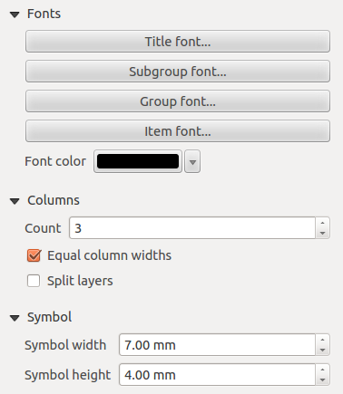
Fonts, Columns, Symbol
The Fonts, Columns and Symbol dialogs of the legend
Item Properties tab provide the following functionalities (see figure_composer_legend_4):
Figure Composer Legend 4:
Puoi cambiare il carattere del titolo, gruppo, sotto-gruppo o elemento singolo della legenda. Clicca sul pulsante corrispondente per aprire la finestra Selezione carattere.
- You provide the labels with a Color using the advanced color picker, however the selected
color will be given to all font items in the legen..
- Legend items can be arranged over several columns. Set the number of columns in
the Count
 field.
La casella di controllo Uguale larghezza delle colonne imposta come le colonne della legenda devono essere gestite.
La casella di controllo Dividi layers ti permette una divisione dei layer in base alla loro categorizzazione.
Puoi cambiare la larghezza e l’altezza di un simbolo della legenda.
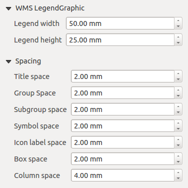
WMS legendGraphic and Spacing
The WMS legendGraphic and Spacing dialogs of the legend
Item Properties tab provide the following functionalities (see
figure_composer_legend_5):
Figure Composer Legend 5:
When you have added a WMS layer and you insert a legend composer item, a request will be send to the
WMS server to provide a WMS legend, This Legend will only be shown if the WMS server provides the
GetLegendGraphic capability. The WMS legend content will be provided as a raster image.
WMS legendGraphic is used to be able to adjust the Legend width and
the legend hight of the WMS legend raster image.
Spacing around title, group, subgroup, symbol, icon label, box space or column space can be customized
through this dialog.
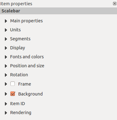
The Scale Bar item
Per aggiungere una barra di scala, clicca su Aggiungi nuova barra di scala , scegli dove posizionarla e clicca con il tasto sinistro del mouse. Hai pieno accesso alla personalizzazione attraverso la scheda Proprietà oggetto.
The Item properties of a scale bar item tab provides the following
functionalities (see figure_composer_scalebar_1):
Figure Composer Scalebar 1:
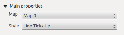
Proprietà principali
The Main properties dialog of the scale bar Item Properties tab
provides the following functionalities (see figure_composer_scalebar_2):
Figure Composer Scalebar 2:
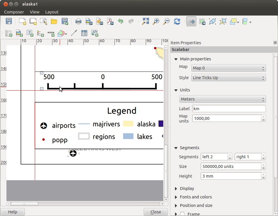
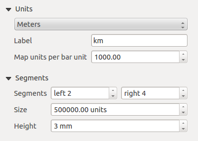
Unità e segmenti
The Units and Segments dialogs of the scale bar Item Properties tab
provide the following functionalities (see figure_composer_scalebar_3):
Figure Composer scalebar 3:
In queste due sezioni puoi scegliere come deve essere rappresentata la barra di scala.
- Select the map units used. There are four possible choices: Map Units is the automated unit
selection; Meters, Feet or Nautical Miles force unit conversions.
Specifica nel campo Etichetta il testo che descriverà l’unità scelta.
Il campo Unità mappa per unità di barra ti permette di fissare il rapporto fra le unità di mappa e la loro rappresentazione nella barra di scala.
Puoi scegliere quanti Segmenti devono essere disegnati a sinistra e a destra della barra di scala e quanto ogni segmento deve essere lungo (Dimensione). Puoi anche scegliere l’Altezza.
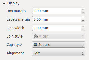
Display
The Display dialog of the scale bar Item Properties tab provide the following functionalities (see figure_composer_scalebar_4):
Figure Composer Scalebar 4:
You can define how the scale bar will be displayed in its frame.
- Box margin : space between text and frame borders
- Labels margin : space between text and scale bar drawing
- Line width : line widht of the scale bar drawing
- Join style : Corners at the end of scalebar in style Bevel, Rounded or Square
(only available for Scale bar style Single Box & Double Box)
- Cap style : End of all lines in style Square, Round or Flat
(only available for Scale bar style Line Ticks Up, Down and Middle)
- Alignment : Puts text on the left, middle or right side of the frame
(works only for Scale bar style Numeric)
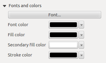
Fonts and colors
The Fonts and colors dialog of the scale bar Item Properties tab
provide the following functionalities (see figure_composer_scalebar_5):
Figure Composer Scalebar 5:
You can define the fonts and colors used for the scale bar.
- Use the [Font] button to set the font
- Font color: set the font color
- Fill color: set the first fill color
- Secondary fill color: set the second fill color
- Stroke color: set the color of the lines of the Scale Bare
Fill colors are only used for scale box styles Single Box and Double Box.
To select a color you can use the list option using the dropdown arrow to open
a simple color selection option or the more advanced color selection option, that is
started when you click in the colored box in the dialog.
The Basic Shape Items
To add a basic shape (ellipse, rectangle, triangle), click the  Add basic shape icon
or the
Add basic shape icon
or the  Add Arrow icon, place the element holding down the left mouse. Customize the
appearance in the Item Properties tab.
Add Arrow icon, place the element holding down the left mouse. Customize the
appearance in the Item Properties tab.
When you also hold down the Shift key while placing the basic shape you can create a perfect square,
circle or triangle.
Figure Composer Basic Shape:
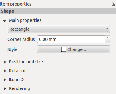
The Shape item properties tab allows you to select if you want to draw an ellipse,
rectangle or triangle inside the given frame.
You can set the style of the shape using the advanced symbol style dialog with which you can
define its outline and fill color, fill pattern, use markers etcetera.
For the rectangle shape, you can set the value of the corner radius to round of the corners.
Nota
Unlike other items, you can not style the frame or the background color of the frame.
The Arrow item
To add an arrow, click the Add Arrow icon, place the element holding
down the left mouse button and drag a line to draw the arrow on the Print Composer canvas and
position and customize the appearance in the scale bar Item Properties tab.
When you also hold down the Shift key while placing the arrow, it is placed in an angle
of exactly 45° .
The arrow item can be used to add a line or a simple arrow that can be used, for example, to
show the relation between other print composer items. To create a north arrow, the image item should
be considered first. QGIS has a set of North arrows in SVG format. Furthermore you can connect
an image item with a map so it can rotate automatically with the map (see the_image_item).
Figure Composer Arrow:
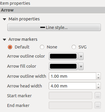
Item Properties
The Arrow item properties tab allows you to configure an arrow item.
The [Line style ...] button can be used to set the line style using the line style symbol editor.
In Arrows markers you can select one of three radio buttons.
- Default : To draw a regular arrow, gives you options to style the arrow head
- None : To draw a line without arrow head
- SVG Marker : To draw a line with an SVG Start marker and/or End marker
For Default Arrow marker you can use following options to style the arrow head.
- Arrow outline color : Set the outline color of the arrow head
- Arrow fill color : Set the fill color of the arrow head
- Arrow outline width : Set the outline width of the arrow head
- Arrow head width: Set the size of the arrow head
For SVG Marker you can use following options.
- Start marker : Choose an SVG image to draw at the beginning of the line
- End marker : Choose an SVG image to draw at the end of the line
- Arrow head width: Sets the size of Start and/or headmarker
SVG images are automatically rotated with the line. The color of the SVG image can not be changed.
The Attribute Table item
Puoi aggiungere parti della tabella degli attributi di un vettore al compositore di stampe: clicca sull’icona  Aggiungi tabella attributi, scegli dove posizionarla e clicca con il tasto sinistro del mouse. In seguito potrai personalizzarne gli aspetti dalla scheda Proprietà oggetto.
The Item properties of an attribute table item tab provides the following
functionalities (see figure_composer_table_1):
Figure Composer Attribute Table 1:
Proprietà principali
The Main properties dialogs of the attribute table Item Properties
tab provide the following functionalities (see figure_composer_table_2):
Figure Composer Attribute Table 2:
For Source you can normally select only ‘Layer features’.
With Layer you can choose from the vector layers loaded in the project.
The button [Refresh table data] can be used to refresh the table when the actual
contents of the table has changed.
The button [Attributes...] starts the Select attributes menu, see
figure_composer_table_3, that can be used to change the visible contents of the table.
After making changes use the [OK] button to apply changes to the table.
In the Columns section you can:
- Remove an attribute, just select an attribute row by clicking anywhere in a row and press
the minus button to remove the selected attribute.
- Add a new attribute use the plus button. At the end a new empty row appears and you can
select empty cell of the column Attribute. You can select a field attribute from
the list or you can select to build a new attribute using a regular expression.
- Use the up and down arrows to change the order of the attributes in the table.
- Select a cel in the Headings column to change the Heading, just type a new name.
- Select a cel in the Alignment column and you can choose between Left, Center or Right alignment.
- Select a cel in the Width column and you can change it from Automatic to a width in mm, just
type a number. When you want to change it back to Automatic, use the cross.
- The [Reset] button can allways be used to restore it to the original attribute settings.
In the Sorting section you can:
- Add an attribute to sort the table with. Select an attribute and set the sorting order to ‘Ascending’
or ‘Descending’ and press the plus button. A new line is added to the sort order list.
- select a row in the list and use the up and down button to change the sort priority on attribute level.
- use the minus button to remove an attribute from the sort order list.
Figure Composer Attribute Table 3:
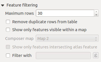
Feature filtering
The Feature filtering dialogs of the attribute table Item Properties
tab provide the following functionalities (see figure_composer_table_4):
Figure Composer Attribute Table 4:
You can:
Define the Maximum rows to be displayed.
Activate Remove duplicate rows from table to show unique records only.
Activate Show only visible features within a map and select the
corresponding Composer map to display the attributes of features only visible
on selected map.
Activate Show only features intersecting Atlas feature is only
available when Generate an atlas is activated. When activated it will
show a table with only the features shown on the map of that particular page of the atlas.
Activate Filter with and provide a filter by typing in the input
line or insert a regular expressing use the given expression button. A few examples of
filtering statements you can use when you have loaded the airports layer from the Sample
dataset:
- ELEV > 500
- NAME = 'ANIAK'
- NAME NOT LIKE 'AN%
- regexp_match( attribute( $currentfeature, 'USE' ) , '[i]')
The last regular expression will include only the arpoirts that have a letter ‘i’
in the attribute field ‘USE’.
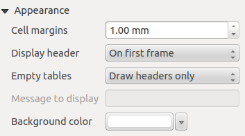
Appearance
The Appearance dialogs of the attribute table Item Properties
tab provide the following functionalities (see figure_composer_table_5):
Figure Composer Attribute Table 5:
- With Cell margins you can define the margin around text in each cell
of the table.
- With Display header you can select from a list one of ‘On first frame’,
‘On all frames’ default option, or ‘No header’.
- The option Empty table controls what will be displayed when the result
selection is empty.
- Draw headers only, will only draw the header except if you have choosen ‘No header’
for Display header.
- Hide entire table, will only draw the background of the table. You can activate
Don’t draw background if frame is empty in Frames
to completely hide the table.
- Draw empty cells, will fill the attribute table with empty cells, this option can
also be used to provide additional empty cells when you have a result to show!
- Show set message, will draw the header and adds a cell spanning all columns and
display a message like ‘No result’ that can be provided in the option
Message to display
- The option Message to display is only activated when you have selected
Show set message for Empty table. The message provided will be shown
in the table in the first row, when the result is an empty table.
- With Background color you can set the background color of the table.
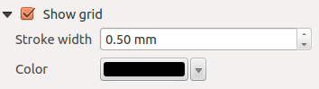
Show grid
The Show grid dialog of the attribute table Item Properties tab
provide the following functionalities (see figure_composer_table_6):
Figure Composer Attribute Table 6:
- Activate Show grid when you want to display the grid, the outlines
of the table cells.
- With Stroke width you can set the thickness of the lines used in the grid.
- The Color of the grid can be set using the color selection dialog.
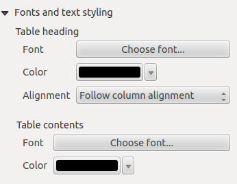
Fonts and text styling
The Fonts and text styling dialog of the attribute table
Item Properties tab provide the following functionalities (see
figure_composer_table_7):
Figure Composer Attribute Table 7:
- You can define Font and Color for Table heading
and Table contents.
- For Table heading you can additionally set the Alignment and
choose from Follow column alignment, Left, Center or Right. The column
alignment is set using the Select Attributes dialog (see Figure_composer_table_3 ).
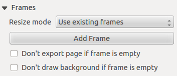
Frames
The Frames dialog of the attribute table Item Properties tab
provide the following functionalities (see figure_composer_table_8):
Figure Composer Attribute Table 8:
- With Resize mode you can select how to render the attribute table contents:
- Use existing frames displays the result in the first frame and added frames only.
- Extent to next page will create as many frames (and corresponding pages) as
necessary to display the full selection of attribute table. Each frame can be moved
around on the layout. If you resize a frame, the resulting table will be divided up
between the other frames. The last frame will be trimmed to fit the table.
- Repeat until finished will also create as many frames as the
Extend to next page option, except all frames will have the same size.
- Use the [Add Frame] button to add another frame with the same size as selected
frame. The result of the table that will not fit in the first frame will continue
in the next frame when you use the Resize mode Use existing frames.
- Activate Don’t export page if frame is empty prevents the page
to be exported when the table frame has no contents. This means all other composer items,
maps, scalebars, legends etc. will not be visible in the result.
- Activate Don’t draw background if frame is empty prevents the
background to be drawn when the table frame has no contents.
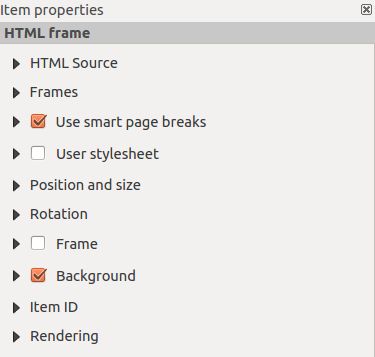
The HTML frame item
It is possible to add a frame that displays the contents of a website or even create and style
your own HTML page and display it!
Click the  Add HTML frame icon, place the element by dragging a
rectangle holding down the left mouse button on the Print Composer canvas and position
and customize the appearance in the Item Properties tab
(see figure_composer_html_1).
Add HTML frame icon, place the element by dragging a
rectangle holding down the left mouse button on the Print Composer canvas and position
and customize the appearance in the Item Properties tab
(see figure_composer_html_1).
Figure Composer HTML 1:
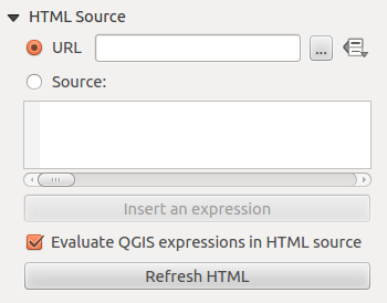
HTML Source
As an HTML source, you can either set a URL and activate the URL radiobutton or
enter the HTML source directly in the textbox provided and activate the Source radiobutton.
The HTML Source dialog of the HTML frame Item Properties tab
provides the following functionalities (see figure_composer_html_2):
Figure Composer HTML 2:
- In URL you can enter the URL of a webpage you copied from your internet
browser or select an HTML file using the browse button . There is also the
option to use the Data defined override button, to provide an URL from the contents of an
attribute field of a table or using a regular expression.
- In Source you can enter text in the textbox with some HTML tags or provide a full
HTML page.
- The [insert an expression] button can be used to insert an expression like
[%Year($now)%] in the Source textbox to display the current year. This button is only
activated when radiobutton Source is selected. After inserting the expression
click somewhere in the textbox before refreshing the HTML frame, otherwise you will
lose the expression.
- Activate Evaluate QGIS expressions in HTML code to see the result of
the expression you have included, otherwise you will see the expression instead.
- Use the [Refresh HTML] button to refresh the HTML frame(s) to see the result of
changes.
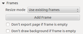
Frames
The Frames dialog of the HTML frame Item Properties tab
provides the following functionalities (see figure_composer_html_3):
Figure Composer HTML 3:
- With Resize mode you can select how to render the HTML contents:
- Use existing frames displays the result in the first frame and added frames only.
- Extent to next page will create as many frames (and corresponding pages) as
necessary to render the height of the web page. Each frame can be moved around on
the layout. If you resize a frame, the webpage will be divided up between the
other frames. The last frame will be trimmed to fit the web page.
- Repeat on every page will repeat the upper left of the web page on every page
in frames of the same size.
- Repeat until finished will also create as many frames as the
Extend to next page option, except all frames will have the same size.
- Use the [Add Frame] button to add another frame with the same size as selected
frame. If the HTML page that will not fit in the first frame it will continue
in the next frame when you use Resize mode or Use
existing frames.
- Activate Don’t export page if frame is empty prevents
the map layout from being exported when the frame has no HTML contents. This
means all other composer items,
maps, scalebars, legends etc. will not be visible in the result.
- Activate Don’t draw background if frame is empty
prevents the HTML frame being drawn if the frame is empty.
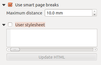
Use smart page breaks and User style sheet
The Use smart page breaks dialog and Use style sheet dialog of
the HTML frame Item Properties tab provides the following functionalities
(see figure_composer_html_4):
Figure Composer HTML 4:
Activate Use smart page breaks to prevent the html frame contents
from breaking mid-way a line of text so it continues nice and smooth in the next frame.
Set the Maximum distance allowed when calculating where to place page
breaks in the html. This distance is the maximum amount of empty space allowed at the
bottom of a frame after calculating the optimum break location. Setting a larger value
will result in better choice of page break location, but more wasted space at the bottom
of frames. This is only used when Use smart page breaks is activated.
Activate User stylesheet to apply HTML styles that often is provided
in cascading style sheets. An example of style code is provide below to set the color of
<h1> header tag to green and set the font and fontsize of text included in paragraph
tags <p>.
h1 {color: #00ff00;
}
p {font-family: "Times New Roman", Times, serif;
   font-size: 20px;
}
Use the [Update HTML] button to see the result of the stylesheet settings.
Gestisci elementi
Dimensione e posizione
Puoi spostare/ridimensionare ogni elemento del compositore per creare un layout di stampa perfetto. Per entrambe le operazioni devi prima attivare cliccare sull’icona Scegli/Sposta oggetto e poi cliccare sull’oggetto corrispondente; ora puoi muoverlo con il pulsante sinistro del mouse. Se vuoi forzare lo spostamento lungo un asse orizzontale o verticale, tieni premuto il tasto Shift. Se hai bisogno di una maggiore precisione usa le Frecce direzionali della tastiera; se il movimento è troppo lento lo puoi velocizzare tenendo premuto il tasto Shift.
A selected item will show squares on its boundaries; moving one of them with the mouse, will resize the item in the corresponding direction. While resizing,
holding Shift will maintain the aspect ratio. Holding Alt will
resize from the item center.
The correct position for an item can be obtained using snapping to grid or
smart guides. Guides are set by clicking and dragging in the rulers. Guide are
moved by clicking in the ruler, level with the guide and dragging to a new
place. To delete a guide move it off the canvas. If you need to disable the
snap on the fly just hold Ctrl while moving the mouse.
Puoi usare lo strumento Sposta/Muovi oggetto su più oggetti contemporaneamente. Tieni premuto il tasto Shift e clicca su tutti gli oggetti che vuoi selezionare. Ora li puoi spostare o ridimensionare tutti in un colpo solo.
Once you have found the correct position for an item, you can lock it by using
the items on the toolbar or ticking the box next to the item in the
tab. Locked items are not selectable on the canvas.
Locked items can be unlocked by selecting the item in the
tab and unchecking the tickbox or you can use the icons
on the toolbar.
Per deselezionare un oggetto, cliccaci sopra tenendo premuto il tasto Shift.
Nel menu , puoi trovare diversi strumenti che ti permettono di selezionare tutti gli elementi, di pulire o invertire la selezione attuale.
Allineamento
Raising or lowering functionalities for elements are inside the  Raise selected items pull-down menu. Choose an element on the Print Composer
canvas and select the matching functionality to raise or lower the selected
element compared to the other elements (see table_composer_1). This order is
shown in the tab. You can also raise or lower objects
in the tab by clicking and dragging an object’s label
in this list.
Raise selected items pull-down menu. Choose an element on the Print Composer
canvas and select the matching functionality to raise or lower the selected
element compared to the other elements (see table_composer_1). This order is
shown in the tab. You can also raise or lower objects
in the tab by clicking and dragging an object’s label
in this list.
Figure Composer 28:
Ci sono diverse funzionalità disponibili nel menu a tendina  Allinea gli oggetti selezionati (vedi table_composer_1). Per usare una di queste funzionalità, seleziona prima alcuni oggetti e poi clicca sull’icona. In questo modo tutti gli elementi verranno allineati all’interno della loro cornice. Quando muovi gli elementi nel compositore, appaiono delle linee ai margini del foglio che ti aiutano ad allineare gli oggetti.
Copia/Taglia e Incolla oggetti
Il compositore di stampe include tutte le azioni più comuni di copia/taglia/incolla per gli oggetti del layout. Prima di tutto seleziona l’oggetto: nel menu potrai trovare le azioni che potrai effettuare. Mentre usi l’azione incolla, gli oggetti verranno incollati nella posizione attuale del mouse.
Nota
HTML items can not be copied in this way. As a workaround, use the [Add Frame] button in the tab.
Generazione atlante
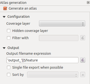
Il compositore di stampe include anche una funzionalità che ti permette di creare automaticamente degli atlanti. Il concetto è quello di usare un vettore di copertura che contiene campi e geometrie. Per ogni geometria di questo vettore potrai creare un nuovo output: ogni nuovo output sarà centrato sulla geometria corrispondente. Puoi usare i campi delle geometrie come etichette per gli output.
Every page will be generated with each feature. To enable the generation
of an atlas and access generation parameters, refer to the Atlas generation
tab. This tab contains the following widgets (see Figure_composer_atlas):
Figure Composer Atlas:
Genera un atlante, che attiva o disattiva la generazione dell’atlante.
Un menu a tendina Layer di copertura  che ti permette di scegliere il layer (vettore) contenente le geometrie che verranno iterate.
Una casella di controllo opzionale Layer copertura nascosto che, se attivata, nasconderà solamente il layer di copertura durante la generazione dell’atlante.
Una casella opzionale Filtra con che ti permette di specificare un’espressione per filtrare le geometrie del layer di copertura. Se l’espressione non è vuota, solamente le geometrie valutate come True verranno selezionate. Premendo il pulsante sulla destra puoi aprire il costruttore di espressioni.
Usa la casella di testo Espressione nome file di output per generare un nome per ogni geometria. Si basa su un’espressione. Questo campo ha senso solamente per la creazione di file multipli.
Una casella di controllo Esporta file singolo se possibile che ti permette di forzare la generazione di un singolo file se è compatibile con il formato di output scelto (per esempio, PDF). Se spuntata, il valore inserito in Espressione del nome di file in output non ha senso.
Una casella di controllo opzionale Ordina per che ti permette di ordinare le geometrie del layer di copertura. Il menu a tendina associato ti permette di scegliere quale colonna dovrà essere usate per l’ordinamento. Puoi impostare l’ordine (crescente o decrescente) grazie al pulsante a destra del menu a tendina.
Puoi usare oggetti multipli con la generazione dell’atlante: ogni mappa verrà visualizzata secondo le geometrie del layer di copertura. Per impostare la generazione dell’atlante per un oggetto specifico, spunta la casella di controllo Controllato dall’atlante nella scheda delle proprietà dell’oggetto. Una volta spuntata potrai impostare:
Un Margine attorno all’elemento che ti permette di selezionare lo spazio attorno ad ogni geometria nella mappa corrispondente. Questo valore ha senso solo usando la modalità scala automatica.
Una casella di controllo Scala fissa che ti permette di passare dalla modalità a scala automatica a quella di scala fissa. In quest’ultima modalità, la mappa verrà generata solamente per le geometrie che possono essere centrate. Nella modalità scala automatica, le estensioni della mappa sono calcolate in modo che ogni geometria appaia in tutta la sua interezza.
Etichette
In order to adapt labels to the feature the atlas plugin iterates over, you can include expressions.
For example, for a city layer with fields CITY_NAME and ZIPCODE, you could insert this:
The area of [% upper(CITY_NAME) || ',' || ZIPCODE || ' is ' format_number($area/1000000,2) %] km2
The information [% upper(CITY_NAME) || ‘,’ || ZIPCODE || ‘ is ‘ format_number($area/1000000,2) %]
is an expression used inside the label. That would result in the generated atlas as:
The area of PARIS,75001 is 1.94 km2
Data Defined Override Buttons
There are several places where you can use a Data Defined Override
button to override the selected setting. These options are particularly usefull with Atlas Generation.
For the following examples the Regions layer of the QGIS sample dataset is used and selected
for Atlas Generation.
We also assume the paper format A4 (210X297) is selected in the Composite tab
for field Presets.
With a Data Defined Override button you can dynamically set the paper orientation.
When the height (north-south) of the extents of a region is greater than it’s width (east-west), you
rather want to use portrait instead of landscape orientation to optimize the use of paper.
In the Composition you can set the field Orientation and select Landscape
or Portrait. We want to set the orientation dynamically using an expression depending on the region geometry.
press the button of field Orientation, select so
the Expression string builder dialog opens. Give following expression:
CASE WHEN bounds_width($atlasgeometry) > bounds_height($atlasgeometry) THEN 'Landscape' ELSE 'Portrait' END
Now the paper orients itself automatically for each Region you need to reposition the location
of the composer item as well. For the map item you can use the button of
field Width to set it dynamically using following expression:
(CASE WHEN bounds_width($atlasgeometry) > bounds_height($atlasgeometry) THEN 297 ELSE 210 END) - 20
Use the button of field Heigth to provide following expression:
(CASE WHEN bounds_width($atlasgeometry) > bounds_height($atlasgeometry) THEN 210 ELSE 297 END) - 20
When you want to give a title above map in the center of the page, insert a label item above the map.
First use the item properties of the label item to set the horizontal alignment to  Center.
Next activate from Reference point the upper middle checkbox.
You can provide following expression for field X :
Center.
Next activate from Reference point the upper middle checkbox.
You can provide following expression for field X :
(CASE WHEN bounds_width($atlasgeometry) > bounds_height($atlasgeometry) THEN 297 ELSE 210 END) / 2
For all other composer items you can set the position in a similar way so they are correctly positioned
when page is automatically rotated in portrait or landscape.
Information provided is derived from the excellent blog (in english and portugese)
on the Data Defined Override options Multiple_format_map_series_using_QGIS_2.6 .
This is just one example of how you can use Data Defined Overrides.
Anteprima
Una volta che hai configurato le impostazioni dell’atlante e che hai selezionato gli oggetti della mappa, puoi creare un’anteprima di tutte le pagine cliccando sul pulsante e usare le frecce dello stesso menu per navigare fra le varie geometrie.
Generazione
Puoi effettuare la generazione dell’atlante in modi diversi. Per esempio tramite il menu . Puoi anche creare un PDF cliccando su : ti verrà chiesto un percorso in cui salvare i PDF (eccetto se hai spuntato la casella di controllo Esporta file singolo se possibile). Se devi stampare solamente una pagina dell’atlante, fai partire l’anteprima, fermati alla pagina che vuoi e clicca su (o esporta come PDF).
Creazione del file in output
Figure_composer_output shows the Print Composer with an example print layout,
including each type of map item described in the sections above.
Figure Composer Output:
Il compositore di stampe ti permette di creare diversi formati di output e puoi scegliere la risoluzione (qualità di stampa) e il formato pagina:
L’icona  Stampa ti permette di stampare il layout su una stampante collegata o su un file PDF o Postscript.
L’icona  Esporta come immagine esporta il layout in diversi formati immagine come PNG, BPM, TIF, JPG,...
L’icona  Esporta come PDF esporta il layout in formato PDF.
L’icona  Esporta come SVG salva il layout di stampa in formato SVG (Scalable Vector Graphic).
If you need to export your layout as a georeferenced image (i.e., to load back
inside QGIS), you need to enable this feature under the Composition tab. Check
World file on and choose the map item to use. With this option, the
‘Export as image’ action will also create a world file.
Nota
- Currently, the SVG output is very basic. This is not a QGIS problem, but a
problem with the underlying Qt library. This will hopefully be sorted out
in future versions.
- Exporting big rasters can sometimes fail, even if there seems to be
enough memory. This is also a problem with the underlying Qt management
of rasters.
Gestisci le composizioni di stampa
With the  Save as template and
  Add items from template icons, you can save the current state of a Print Composer
session as a .qpt template and load the template again in another session.
Add items from template icons, you can save the current state of a Print Composer
session as a .qpt template and load the template again in another session.
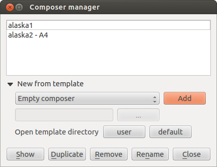
Il pulsante  Gestore composizioni nella barra di QGIS nel menu ti permette di aggiungere un nuovo modello di stampa basato su un modello salvato o di gestire modelli già esistenti.
Figure Composer Manager:
In modo predefinito, il gestore composizioni cerca i modelli nella cartella
I pulsanti Nuova composizione e  Duplica composizione nella barra degli strumenti di QGIS e nel menu e ti permettono di aprire una nuova finestra di dialogo in cui creare un nuovo layout oppure di duplicare un layout esistente.
Infine, puoi salvare le tue composizioni con il pulsante Salva progetto. È lo stesso pulsante presente nella finestra principale di QGIS. Tutti i cambiamenti e le modifiche verranno quindi salvate su un file di progetto di QGIS.


 : con questo strumento puoi decidere il grado di visibilità del vettore. Usa questo cursore per adattare la trasparenza del vettore. Puoi anche impostare un valore preciso di trasparenza nella casella presente a destra del cursore.
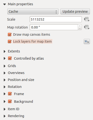

 button allows you to add quickly all the presets views you
have prepared in QGIS.
Clicking on the
button allows you to add quickly all the presets views you
have prepared in QGIS.
Clicking on the  button. See Legenda to find out how to
create presets views.
button. See Legenda to find out how to
create presets views.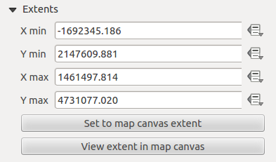
