Dialogfenster Rasterlayereigenschaften
Um die Eigenschaften eines Rasterlayers zu sehen oder einzustellen doppelklicken Sie auf den Layernamen in der Legende oder rechtsklicken Sie auf den Layernamen und wählen Sie Eigenschaften aus dem Kontextmenü:
Dies öffnet den Layereigenschaften Dialog, (siehe figure_raster_1).
There are several menus in the dialog:
Allgemein
Stil
Transparenz
Pyramiden
Histogramm
Metadaten
Figure Raster 1:
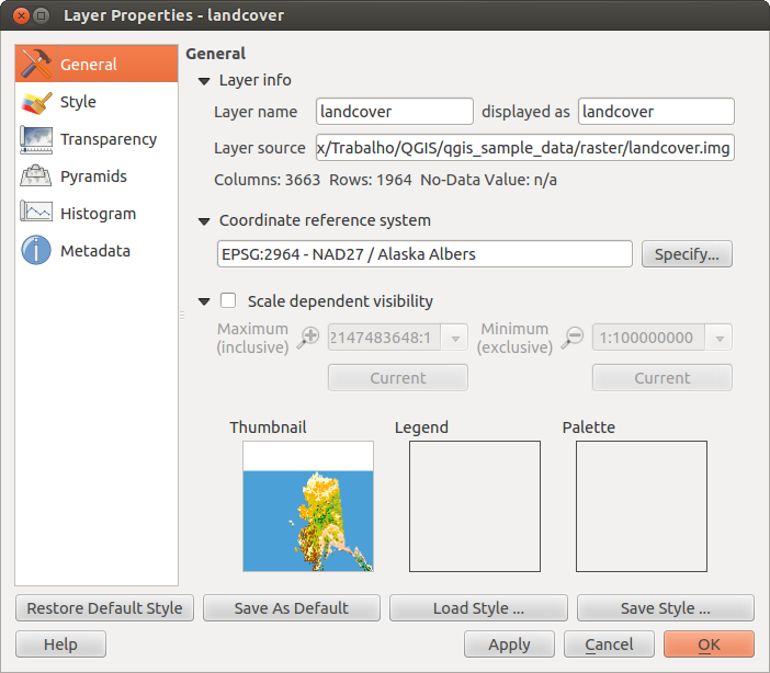
Raster Layers Properties Dialog 
Style Menu
Band rendering
QGIS offers four different Render types. The renderer chosen is dependent on the data type.
- Multiband color - if the file comes as a multi band with several bands (e.g. used with a satellite image with several bands)
- Paletted - if a single band file comes with an indexed palette (e.g. used with a digital topographic map)
- Singleband gray- (one band of) the image will be rendered as gray, QGIS will choose this renderer if the file neither has multi bands, nor has an indexed palette nor has a continous palette (e.g. used with a shaded relief map)
- Singleband pseudocolor - this renderer is possible for files with a continuous palette, e.g. the file has got a color map (e.g. used with an elevation map)
Multiband color
With the multiband color renderer three selected bands from the image will be rendered, each band representing the red, green or blue component that will be used to create a color image. You can choose several Contrast enhancement methods: ‘No enhancement’, ‘Stretch to MinMax’, ‘Stretch and clip to MinMax’ and ‘Clip to min max’.
Figure Raster 2:
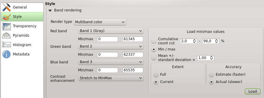
Raster Renderer - Multiband color
This selection offers you a wide range of options to modify the appearance
of your rasterlayer. First of all you have to get the data range from your
image. This can be done by choosing the Extent and pressing
[Load]. QGIS can  Estimate (faster) the
Min and Max values of the bands or use the
Estimate (faster) the
Min and Max values of the bands or use the
 Actual (slower) Accuracy.
Now you can scale the colors with the help of the Load min/max values section.
A lot of images have few very low and high data. These outliers can be eliminated
using the Cumulative count cut setting. The standard data range is set
from 2% until 98% of the data values and can be adapted manually. With this
setting the gray character of the image can disappear.
With the scaling option Min/max QGIS creates a color table with
the whole data included in the original image. E.g. QGIS creates a color table
with 256 values, given the fact that you have 8bit bands.
You can also calculate your color table using the Mean +/- standard deviation x  .
Then only the values within the standard deviation or within multiple standard deviations
are considered for the color table. This is useful when you have one or two cells
with abnormally high values in a raster grid that are having a negative impact on
the rendering of the raster.
.
Then only the values within the standard deviation or within multiple standard deviations
are considered for the color table. This is useful when you have one or two cells
with abnormally high values in a raster grid that are having a negative impact on
the rendering of the raster.
All calculation can also be made for the Current extend.
Tipp
Einen einzelnen Kanal eines Mehrkanal-Rasterlayers anzeigen
If you want to view a single band (for example Red) of a multiband image, you might think you would set the Green and Blue bands to “Not Set”. But this is not the correct way. To display the Red band, set the image type to ‘Singleband gray’, then select Red as the band to use for Gray.
Paletted
This is the standard render option for singleband files that already include a color table, where each pixel value is assigned to a certain color. In that case, the palette is rendered automatically. If you want to change colors assigned to certain values, just double-click on the color and the Select color dialog appears.
Figure Raster 3:
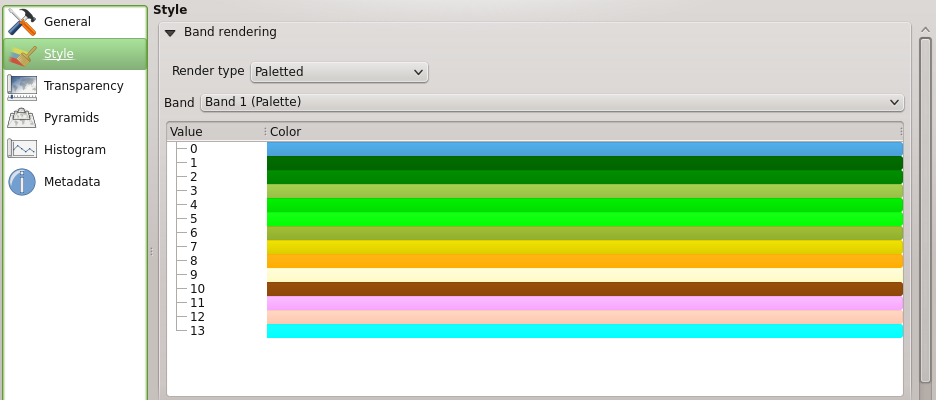
Raster Renderer - Paletted
Kontrastverbesserung
Bemerkung
When adding GRASS rasters the option Contrast enhancement will be always set to automatically to stretch to min max regardless if the QGIS general options this is set to another value.
Singleband gray
This renderer allows you to render a single band layer with a Color gradient
‘Black to white’ or ‘White to black’. You can define a Min
and a Max value with choosing the Extend first and
then pressing [Load]. QGIS can Estimate (faster) the
Min and Max values of the bands or use the
Actual (slower) Accuracy.
Figure Raster 4:
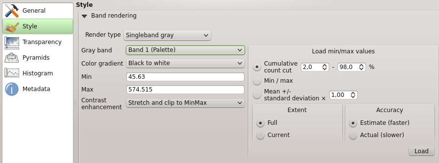
Raster Renderer - Singleband gray
With the Load min/max values section scaling of the color table
is possible. Outliers can be eliminated using the Cumulative count cut setting.
The standard data range is set from 2% until 98% of the data values and can
be adapted manually. With this setting the gray character of the image can disappear.
Further settings can be made with Min/max and
Mean +/- standard deviation x .
While the first one creates a color table with the whole data included in the
original image the second creates a colortable that only considers values
within the standard deviation or within multiple standard deviations.
This is useful when you have one or two cells with abnormally high values in
a raster grid that are having a negative impact on the rendering of the raster.
Singleband pseudocolor
This is a render option for single band files including a continous palette. You can also create individual color maps for the single bands here.
Figure Raster 5:
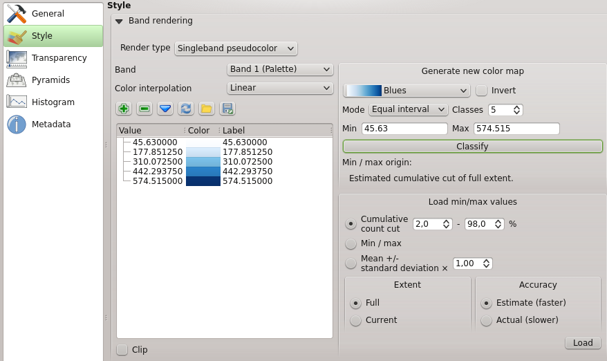
Raster Renderer - Singleband pseudocolor
Three types of color interpolation are available:
Diskret
- Linear
Genau
In the left block the button  Add values manually adds a value to the
individual color table. Button
Add values manually adds a value to the
individual color table. Button  Remove selected row
deletes a value from the individual color table and the
Remove selected row
deletes a value from the individual color table and the
 Sort colormap items button sorts the color table according
to the pixel values in the value column. Double clicking on the value-column lets
you insert a specific value. Double clicking on the color-column opens the dialog
Change color where you can select a color to apply on that value. Further
you can also add labels for each color but this value won’t be displayed when you use the identify
feature tool.
You can also click on the button
Sort colormap items button sorts the color table according
to the pixel values in the value column. Double clicking on the value-column lets
you insert a specific value. Double clicking on the color-column opens the dialog
Change color where you can select a color to apply on that value. Further
you can also add labels for each color but this value won’t be displayed when you use the identify
feature tool.
You can also click on the button  Load color map from band,
which tries to load the table from the band (if it has any). And you can use the
buttons
Load color map from band,
which tries to load the table from the band (if it has any). And you can use the
buttons  Load color map from file or
  Export color map to file to load an existing color table or to save the
defined color table for other sessions.
Export color map to file to load an existing color table or to save the
defined color table for other sessions.
In the right block Generate new color map allows you to create newly
categorized colormaps. For the Classification mode  ‘Equal interval’
you only need to select the number of classes
and press the button Classify. You can invert the colors
of the the color map by clicking the
‘Equal interval’
you only need to select the number of classes
and press the button Classify. You can invert the colors
of the the color map by clicking the  Invert
checkbox. In case of the Mode ‘Continous’ QGIS creates
classes depending on the Min and Max automatically.
Defining Min/Max values can be done with the help of Load min/max values section.
A lot of images have few very low and high data. These outliers can be eliminated
using the Cumulative count cut setting. The standard data range is set
from 2% until 98% of the data values and can be adapted manually. With this
setting the gray character of the image can disappear.
With the scaling option Min/max QGIS creates a color table with
the whole data included in the original image. E.g. QGIS creates a color table
with 256 values, given the fact that you have 8bit bands.
You can also calculate your color table using the Mean +/- standard deviation x .
Then only the values within the standard deviation or within multiple standard deviations
are considered for the color table.
Invert
checkbox. In case of the Mode ‘Continous’ QGIS creates
classes depending on the Min and Max automatically.
Defining Min/Max values can be done with the help of Load min/max values section.
A lot of images have few very low and high data. These outliers can be eliminated
using the Cumulative count cut setting. The standard data range is set
from 2% until 98% of the data values and can be adapted manually. With this
setting the gray character of the image can disappear.
With the scaling option Min/max QGIS creates a color table with
the whole data included in the original image. E.g. QGIS creates a color table
with 256 values, given the fact that you have 8bit bands.
You can also calculate your color table using the Mean +/- standard deviation x .
Then only the values within the standard deviation or within multiple standard deviations
are considered for the color table.
Color rendering
For every Band rendering a Color rendering is possible.
You can achieve special rendering effects for your raster file(s) using one one of the blending modes (see blend_modes).
Further settings can be made in modifiying the Brightness, the Saturation and the Contrast. You can use a Grayscale option where you can choose between ‘By lightness’, ‘By luminosity’ and ‘By average’. For one hue in the color table you can modiy the ‘Strength’.
Resampling
The Resampling option makes it appearance when you zoom in and out of the image. Resampling modes can optimize the appearance of the map. They calculate a new gray value matrix through a geometric transformation.
While applying the ‘Nearest neighbour’ method the map can have a pixelated structure when zooming in. This appearance can be improved by using the ‘Bilinear’ or ‘Cubic’ method. Sharp features are caused to be blurred now. The effect is a smoother image. The method can be applied e.g. to digital topographic raster maps.
Transparency Menu
QGIS has the ability to display each raster layer at varying transparency levels.
Use the transparency slider  to indicate to what extent the underlying layers
(if any) should be visible though the current raster layer. This is very useful,
if you like to overlay more than one rasterlayer, e.g. a shaded relief map
overlayed by a classified rastermap. This will make the look of the map more
three dimensional.
to indicate to what extent the underlying layers
(if any) should be visible though the current raster layer. This is very useful,
if you like to overlay more than one rasterlayer, e.g. a shaded relief map
overlayed by a classified rastermap. This will make the look of the map more
three dimensional.
Additionally you can enter a rastervalue, which should be treated as NODATA in the Additional no data value menu.
Die Transparenz kann noch flexibler über die Transparente Pixelliste angepasst werden. Die Transparenz jedes Pixels kann hier eingestellt werden.
Als Beispiel wollen wir die Wasserflächen aus dem Rasterlayer landcover.tif auf eine Transparenz von 20% setzen. Folgende Schritte sind dazu notwendig:
Laden Sie den Rasterlayer landcover aus dem Alaska Beispieldatensatz
Öffnen Sie den Dialog Layereigenschaften indem Sie auf den Namen in der Legende doppelklicken, oder im Rechte-Maustaste Menü Eigenschaften auswählen.
- Select the Transparency menu
- From the Transparency band menu choose ‘None’.
- Click the Add values manually
button. A new row will appear in the pixel-list.
- Enter the raster-value (we use 0 here) in the ‘From’ and ‘To’ column and adjust the transparency to 20 %.
Drücken Sie den Knopf [Anwenden] und schauen Sie sich das Ergebnis an.
You can repeat the steps 5 and 6 to adjust more values with custom transparency.
As you can see this is quite easy to set custom transparency, but it can be
quite a lot of work. Therefore you can use the button  Export to file to save your transparency list to a file. The button
Import from file loads your transparency settings and
applies them to the current raster layer.
Export to file to save your transparency list to a file. The button
Import from file loads your transparency settings and
applies them to the current raster layer.
Histogram Menu
The Histogram menu allows you to view the distribution of the bands
or colors in your raster. It is generated automatically when you open the
Histogram menu. All existing bands will be displayed together. You can
save the histogram as an image with the button.
With the Visibility option in the  Prefs/Actions menu
you can display histograms of the individual bands. You will need to select the option
Show selected band.
The Min/max options allow you to ‘Always show min/max markers’, to ‘Zoom
to min/max’ and to ‘Update style to min/max’.
With the Actions option you can ‘Reset’ and ‘Recompute histogram’ after
you have chosen the Min/max options.
Prefs/Actions menu
you can display histograms of the individual bands. You will need to select the option
Show selected band.
The Min/max options allow you to ‘Always show min/max markers’, to ‘Zoom
to min/max’ and to ‘Update style to min/max’.
With the Actions option you can ‘Reset’ and ‘Recompute histogram’ after
you have chosen the Min/max options.